People make quick judgments. Is your current branding worth remembering?
There are more than 500,000 brands around the world within over 2,000 product categories (Neilson Media Research). Your brand is fighting to be remembered.
Let’s dig into what components create a strong brand visually — like an eye-catching logo and a standout color scheme — and how to incorporate these key elements into your vehicle graphics!

Symbolic or Literal: Which style of logo should you incorporate in your vehicle graphics?
When designing your logo, it’s essential to build it from within, ensuring it resonates with your brand’s core values and identity.
A logo doesn’t have to be literal; in fact, a symbolic design can often be more powerful. If your company chooses to take this route, a symbolic logo can capture the essence of your brand in a more abstract and impactful way.
A well-known example of a symbolic logo is the Starbucks Siren. The name “Starbucks” was inspired by the book Moby Dick, so the founders went along with a nautical and magical theme. After pulling inspiration from marine-themed books, the famous siren was born! Not only does the icon connect with the origin of the name, but relates to their hometown of Seattle, which is surrounded by Puget Sound, an important body of water for the area (Starbucks).
If a symbolic logo is not what you’re envisioning for your brand, literal designs are just as successful. Play into the industry you are part of, like Blue Chip Plumbing did with their water droplet. Or, go even more literal like Domino’s Pizza did, featuring a domino on much of their branding!
The options are endless! However, if you need assistance while turning your branding into a striking vehicle wrap, our in-house design team is ready to get to work. Each vehicle graphics project includes a consultation where our expert designers can color-match your existing designs, or can assist you through the build of your logo from scratch.
Build Brand Recognition with a Consistent Color Scheme
Transitioning to color, choosing the right color scheme for your vehicle graphics is crucial in ensuring that your fleet stands out on the road. There are two common color schemes you can utilize to make a huge impact: complementary and analogous.
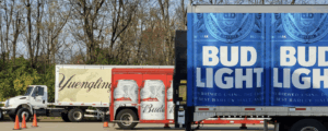
Looking at a color wheel, complementary colors are directly across from each other. Think orange and blue, purple and green, blue and yellow. Complementary colors will appear bolder and brighter, drawing eyes from across the street (Canva). Here are examples of some eye-catching complementary logos!
Next up: analogous colors. These are colors that share a side of the color wheel. Because they sit next to each other on the color wheel, they flow into each other. This creates a natural and harmonious feel to them (ColorPsychology). A common analogous color scheme features greens and yellows. Take a look at Ale-8-One and FirstLight Home Care. Their designs are not overly contrasted like the complementary colors, but because the colors fit well together, these vehicle wraps draw the viewers attention easily.
One thing to keep in mind here is that color improves brand recognition by up to 80% (Forbes). With this said, creating a cohesive color scheme is imperative when you want to be remembered by potential customers.
Case Study: Oasis Tree & Turf Vehicle Wrap
There are so many factors that go into creating a brand’s visual elements, and how those elements translate to a vehicle wrap. To break it down even further, let’s look at Oasis Turf & Tree, a lawn care company serving the Northern Kentucky and Southwest Ohio region with their large fleet of vehicles.
Their use of an analogous color scheme plays into the natural colors seen outdoors. The greens and yellows reflect the colors in grass, trees, the sun, and flowers. The colors in their graphics connect with a playful design featuring outdoor imagery, which reflects their service in the landscape industry. It is an effective choice and shows how color can relate to service offerings.
Next up is the toucan in their logo, a symbol for their company. Their mascot does not literally relate to their service, but it does connect to their slogan: “Wild about your lawn.” It is simple, unique and recognizable, all necessary aspects of a well-known logo (AdRoll). Plus, it brings a fun and creative look to their vehicle graphics!

Overall, Oasis Turf & Tree’s branding stands out on the road because of their intentional details. Its cohesive color scheme, along with the unique logo, is the picture-perfect example for effective branding.
Increase Impressions and Brand Awareness with Vehicle Graphics
The more times people see your vehicles providing service or delivering products, the more your impressions grow, causing potential clients and customers to remember you.
Keep in mind that on average it takes 5-7 impressions of your brand for someone to remember it (SmallBizGenius).
Now why does this matter? You worked hard on building your brand and creating a memorable logo. Now, you need to make sure that your branding is everywhere it can possibly be!

Drive Your Branding with Advertising Vehicles
Displaying your brand has never been easier with vehicle graphics. This is where Advertising Vehicles comes in. While your branding is on your website, social media, products, business cards, it should also be proudly displayed on your company vehicles.
Are you ready to take the next step in advertising your brand? Contact us at Advertising Vehicles, and let us help you elevate your fleet with vehicle graphics! Our team specializes in high quality production and nationwide installation, and our design team will ensure your branding translates perfectly on your vehicles!